![OA_Logo-600x600-1.png]](https://www.omnially.com/hs-fs/hubfs/OA_Logo-600x600-1.png?height=40&name=OA_Logo-600x600-1.png)
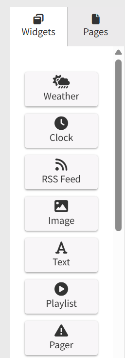
Where to find it: Canvas editor → left sidebar → Widgets tab
Widgets are the building blocks of every Canvas page. A widget is any content element you place on a page, such as media, text, data, or an interactive control. Widgets are positioned freely on the canvas, can overlap and layer, and each has its own settings panel.
There are several widget types, each suited to a different kind of content:
|
Widget |
What it displays |
|
Text |
A block of rich text, with optional scrolling. |
|
Image |
A single image from a file or web address. |
|
App |
A self-contained web-based application. |
|
Playlist |
A media playlist that cycles inside the widget area. |
|
Clock |
The live date and time for a chosen timezone. |
|
Weather |
Current or forecast weather. Requires the AccuWeather integration. |
|
RSS Feed |
Scrolling headlines from one or more feeds. |
|
Pager |
An alert overlay triggered by an incoming feed. |
|
Donor List |
A cycling list of donor names and recognition information. |
|
Popup |
Another canvas page shown as an overlay on the current one. |
|
QR Code |
A QR code generated from a web address. |
|
Search Bar |
A text box that filters a connected Donor List. |
|
Thermometer |
A fundraising progress indicator built from two images. |
Accessing Widgets
The Widgets tab on the left side of the editor contains all available widget types. Clicking a widget that’s already on the canvas opens its settings in the panel on the right. Your changes stay local until you save the project.
Adding a Widget
To Add a Widget
1. Open the Widgets tab in the left sidebar.
2. Locate the widget type you want to use.
3. Drag the widget onto the canvas.
4. Position and resize it as needed.
5. Configure its settings in the panel on the right.
Tip Use Preview mode to test how a widget looks and behaves before sending it to a device.
Common Widget Settings
These settings appear on every widget, at the top of its settings panel.
|
Setting |
Description |
|
Name |
A label for the widget within the editor. Required, since the widget can’t be saved without one. It’s also used to identify the widget when connecting widgets together. |
|
X / Y |
The widget’s position on the canvas, in pixels. X is measured from the left edge and Y from the top. Negative values place the widget partly outside the canvas. |
|
Width / Height |
The widget’s size, in pixels. |
|
Rotation |
The rotation angle, in degrees (0 to 360), around the widget’s own centre. Not available for the Donor List widget. |
|
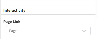
Page Link |
Links the widget to another page in the same project, so tapping it on a touch display navigates to that page. Set it to “No link” to disable. Image widgets also offer an alternate image shown while the screen is pressed. |
|
Data Flow Interaction |
Connects this widget to events from another widget, creating reactive behaviour (for example, a Search Bar driving a Donor List). See the Dataflow & Transitions article. |
Page Links
A widget can be set to navigate to another page when a viewer taps or clicks it on the display. This is useful for interactive kiosks, navigation menus, information displays, and touchscreen experiences.
To Configure a Page Link
1. Select a widget.
2. Open the Settings panel.
3. Locate the Page Link option.
4. Select the destination page.
5. Save your changes.
Tip The link is triggered when a viewer taps or clicks the widget on the live display, not when you select it in the editor. Use Preview mode to test the widget’s interactivity and how it fits into the full canvas before it goes to the device.
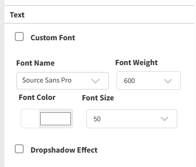
Text Styling
Most widgets that show text share a common set of styling options in their settings panel:
|
Option |
Description |
|
Custom Font |
Upload a font file to use instead of the system fonts. |
|
Font Family |
Choose from the available system fonts. |
|
Font Weight |
Choose the weight (for example, regular or bold). |
|
Font Color |
Pick the text colour. |
|
Font Size |
Choose the size, in points. |
|
Drop Shadow |
An optional shadow, with control over its colour, opacity, blur, and position. |
Text styling is available on the Text, RSS Feed, Pager, Clock, Donor List, and Thermometer widgets, and on the Weather widget when its condition text is shown. The Image, App, Playlist, Popup, QR Code, and Search Bar widgets don’t include text styling, since they display visual or interactive content rather than configurable text.
Widget Types
Text
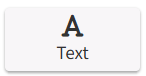
Displays a block of rich text, with support for both automatic and manual scrolling.
|
Setting |
Description |
|
Rich text editor |
A what-you-see-is-what-you-get editor for the content, supporting bold, italic, size, alignment, and more. |
|
Automatic scrolling |
Scrolls the text on its own, with a speed control. An option can force continuous scrolling even when all the text already fits. |
|
Manual scrolling |
Lets viewers scroll the text by touch, with a speed control. |
|
Direction |
Whether scrolling runs vertically or horizontally. |
Image
Displays a single image from an uploaded file or a web address. An alternate image can be shown while the screen is being pressed, which is useful for button-like feedback on touch displays.
|
Setting |
Description |
|
Fit mode |
How the image fills the area. Fill covers the area (cropping or stretching as needed), while Scale fits the image within the area and may leave space around it. |
|
Image source |
Upload a PNG or JPEG, or enter a web address. Entering an address clears any uploaded file. |
App
Embeds a self-contained web-based application inside the widget area. The app runs on its own, so no text styling options apply.
|
Setting |
Description |
|
App source |
Upload an application package, or enter a web address. Choosing one clears the other. |
Note App widgets are an advanced feature. The application package is usually prepared for you; if you need one set up, contact support.
Playlist
Cycles through a media playlist inside the widget area. It can also act as a screensaver that starts after a period of inactivity.
|
Setting |
Description |
|
Playlist |
Choose a playlist from those available in your company. If there are none, a link to create one is shown. |
|
Fit mode |
Fill or Scale, the same as the Image widget. |
|
Resize on alert |
When an alert fires, the playlist shrinks to a set size rather than disappearing, so your media stays visible alongside the alert. |
|
Use as screensaver |
The playlist acts as a screensaver, starting after a set period of inactivity. An option can also restart any App widgets when the screensaver begins. |
Clock
Displays the live date and time for a chosen timezone.
|
Setting |
Description |
|
Timezone |
Required. Choose from the full list of timezones. |
|
Date format |
Choose a ready-made date format, or define your own. Each option previews the current date. |
|
Time format |
Choose a ready-made time format, or define your own, with a live preview. |
|
Text alignment |
Set the horizontal and vertical alignment. |
|
Display horizontally |
Show the date and time side by side instead of stacked. |
Weather
Displays current or forecast weather. Each element (temperature, icons, condition text) can be turned on independently, so you can show exactly what you need.
Note The Weather widget requires the AccuWeather integration to be active for your company. If it isn’t connected, the panel shows a link to set it up instead of the settings.
|
Setting |
Description |
|
Day to forecast |
Choose which day to show (today, tomorrow, and so on). |
|
City |
Search for and select a city, which sets the city, state, and country. |
|
Show city / state / country |
Separate toggles for each, available once a city is selected. |
|
Temperature |
Show the temperature, with a choice of Celsius or Fahrenheit. |
|
Current temperature |
Show the exact current temperature alongside the day’s high and low (today only). |
|
Weather icons |
Show weather icons, with a choice of theme and animation speed. |
|
Weather status |
Show the condition description, with its own text styling. |
RSS Feed
Scrolls headlines from one or more RSS feeds, merged into a single stream.
|
Setting |
Description |
|
Feeds |
One or more feed addresses. Each is checked when you enter it, and multiple feeds are merged together. |
|
Polling |
How often to check the feeds for new content, in seconds. |
|
Scrolling speed |
Turn scrolling on or off, with a speed control. |
Pager
An alert overlay that activates when specific content appears in a monitored feed. When triggered, it can cover part or all of the canvas to show emergency or alert content, and clears automatically when a stop signal appears in the feed or the alert expires.
|
Setting |
Description |
|
Activation feeds |
The feed addresses watched for alert content. |
|
Stop signal |
One or more words whose appearance in the feed ends the alert. |
|
Alert expiration |
The maximum time, in seconds, the alert stays active. |
|
Polling |
How often to check the feed, in seconds. |
|
Scrolling speed |
Turn scrolling on or off for the alert text, with a speed control. |
|
Background image |
A PNG or JPEG shown behind the alert while it’s active. |
Note The Pager can also connect to the AlertCTRL alerting service. That setup is usually arranged with support.
Donor List
Displays a list of donors and their recognition information, drawing its data from a Table. It’s the most configurable widget, with controls for layout, automatic page-shifting, and filtering through a connected Search Bar.
|
Setting |
Description |
|
Margins |
Top, bottom, left, right, and centre margins, in pixels. |
|
Line breaks |
Words that force a line break before or after them, to keep names tidy. |
|
Order names |
How names are sequenced in the display. |
|
Text overflow |
How to handle names that don’t fit, either pushing them to the next cell or adjusting spacing to fit. |
|
Columns and rows |
How many columns and rows of names appear at once. |
|
Words replacement |
A substitution list for standardising text, for example normalising abbreviations. |
|
Multi-page shifting |
Automatically advances through groups of names, with a delay between shifts and an optional transition. |
|
Search configuration |
Defines how a connected Search Bar filters the list, including which field to search and the placeholder text. |
|
Data sources |
Where the names come from. Supports Blackbaud, DonorPerfect, spreadsheet upload, and dashboard Tables, and several can be combined. |
Note The Donor List widget always draws its data from a Table. Tables are a general-purpose data store used elsewhere in the dashboard too, but this widget is specifically for displaying donors. See the Tables article.
Popup
Takes another canvas page and displays it as an overlay over the current page, within the widget’s bounds, shown from the page’s top left-most pixel. This lets you reveal extra content without sending viewers to a different screen, for example showing a donor’s details when their name is tapped. The widget itself is transparent and acts as the container for the overlay page.
|
Setting |
Description |
|
Page |
Which canvas page to display inside the popup. |
|
Default state |
Whether the popup starts visible or hidden (see below). |
|
Timeout |
How long, in seconds, before the popup hides automatically. Set it to 0 to disable auto-hide. |
|
Show transition |
The animation used when the popup appears. |
|
Hide transition |
The animation used when the popup disappears. |
The starting state, combined with the timeout, determines how and when the popup appears:
|
State |
Timeout |
What it does |
|
Visible |
Enabled |
Starts visible, then hides automatically once the timeout elapses. |
|
Visible |
Disabled |
Starts visible and stays visible as soon as the page loads. |
|
Hidden |
Enabled |
Starts hidden, then appears automatically once the timeout elapses. |
|
Hidden |
Disabled |
Starts hidden and waits until something triggers it to appear. |
Popup animations are covered in the Dataflow & Transitions article.
QR Code
Generates a QR code from a web address. It can be a plain link, or an interactive search link for a Donor List, in which case the address is generated for you.
|
Setting |
Description |
|
URL |
The web address to encode. Must be a valid address. |
|
Use as |
Whether the code is a plain link or an interactive search link for a Donor List. |
|
Widget |
When used as a search link, the Donor List on the canvas it connects to. |
Search Bar
A text box that filters a connected Donor List in real time. It’s designed for touch-screen kiosks, where an on-screen keyboard lets viewers type without a physical keyboard.
|
Setting |
Description |
|
Donor List |
Which Donor List on the same canvas this search bar controls. |
|
Search duration |
How long results stay active, in seconds, before the Donor List returns to its default view. |
|
On-screen keyboard |
When enabled, tapping the search bar opens an on-screen keyboard, useful for touch kiosks. |
Thermometer
A fundraising progress indicator built from two layered images: a fill (the “mercury”) and a frame (the body). The fill grows across the image as donations increase, driven either by a value you enter or by a linked dashboard Item.
|
Setting |
Description |
|
Progress layer |
The image used as the fill, the “mercury” of the thermometer. PNG or JPEG, required. |
|
Framework layer |
The image used as the body or background. PNG or JPEG, required. |
|
Donations source |
Enter a value manually, or pull it from a dashboard Item. |
|
Current donations |
The current total. Shown when the value is entered manually. |
|
Item |
The linked Item. Shown when the value comes from an Item. |
|
Max donations |
The target or goal value. |
|
Growth direction |
Which way the fill grows: bottom to top, top to bottom, left to right, or right to left. |
|
Start and end pixel |
Where the fill begins and ends along the image. |
|
Show progress |
An optional text overlay showing the progress, such as a percentage or dollar amount. |
Best Practices
• Name widgets clearly. Descriptive names make larger projects easier to maintain.
• Keep layouts organised. Use alignment and consistent spacing.
• Avoid overlapping important content. Review the layer order carefully so key content stays visible.
• Use the right widget type. Choose the widget designed for the content you want to display.
• Test interactive content in Preview mode. Verify links, popups, and navigation before publishing.