![OA_Logo-600x600-1.png]](https://www.omnially.com/hs-fs/hubfs/OA_Logo-600x600-1.png?height=40&name=OA_Logo-600x600-1.png)
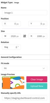
Image Widget Overview
Purpose
The image widget is for display still images statically on the screen. Useful for buttons, backgrounds and more.
Field and Button Descriptions
Name
A description of the widget. This is optional, but highly recommended as it will keep your Canvas cleaner and easier to navigate in the future as well as during build.
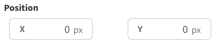
Position
The Position section is to identify where the top left of the widget will be positioned within the Canvas.
- X = Horizontal or Left/Right axis
- Y = Vertical or Up/Down axis
0x0 indicates a starting point of the top left of the selected widget at the top left of the Canvas.
Size
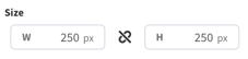
- W = Width of the widget (left/right)
- H = Height of the widget (up/down)
Negative Values
Negative values can be applied if you need to strategically allow a widget to go off-screen, but be aware that content outside of the Canvas boundaries don't appear on the display.
To apply negative values, write the number positively and then add the minus symbol afterwards
Rotation
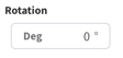
Rotate the widget if desired. The number is the amount in degrees that you can rotate the widget.
General Configuration
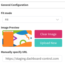
Fit Mode
This lets you decide if you want the uploaded image to Fill or Scale the image to the widget's container size.
Fill
Stretches the image to fill as much of its spot on the Donor List widget as possible.
Scale
Maintains the image's original aspect ratio, making it as large as it can for the space, making it either the largest width or largest height to fill its space on the Image widget - whatever comes first.
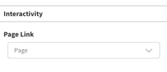
Interactivity