![OA_Logo-600x600-1.png]](https://www.omnially.com/hs-fs/hubfs/OA_Logo-600x600-1.png?height=40&name=OA_Logo-600x600-1.png)
Text Widget Overview
Purpose
The text widget is intended for text that may change with moderate frequency manually, or that needs to change dynamically.
Field and Button Descriptions
Name
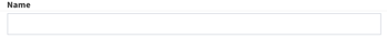
A description of the widget. This is optional, but highly recommended as it will keep your Canvas cleaner and easier to navigate in the future as well as during build.
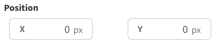
Position
The Position section is to identify where the top left of the widget will be positioned within the Canvas.
- X = Horizontal or Left/Right axis
- Y = Vertical or Up/Down axis
0x0 indicates a starting point of the top left of the selected widget at the top left of the Canvas.
Size
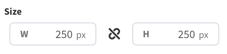
- W = Width of the widget (left/right)
- H = Height of the widget (up/down)
Negative Values
Negative values can be applied if you need to strategically allow a widget to go off-screen, but be aware that content outside of the Canvas boundaries don't appear on the display.
To apply negative values, write the number positively and then add the minus symbol afterwards
Rotation
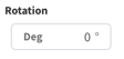
Rotate the widget if desired. The number is the amount in degrees that you can rotate the widget.
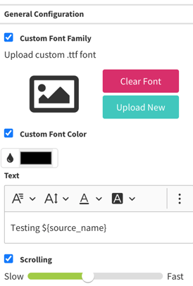
General Configuration

Custom Font Family
Upload a specific font using a TTF file. To make this work you will need to highlight the text you want to use that font and then choose "Custom" from the Font Family dropdown.
Custom Font Color
To use a specific font color:
- Highlight the text you want the color changed on
- Click the checkbox
- Click the color box
- Select the color
Text
 Font Family: This is where you select the font from the list of Google Fonts.
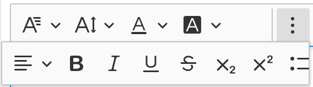
 Font Size: Change the size of the text.
 Font Color: Change the color of the text.
 Font Background Color: To highlight certain text.
 Text Alignment: To set the horizontal text alignment.
 Bold: Make the text bold.
 Italic: Make the text italic.
 Underline: Underline the text.
 Strikethrough: Add a strikethrough line across the text.
 Subscript: Have the text be very small and to the bottom of regular words.
 Superscript: Have the text be very small and to the top of regular words.
 Bullet Points: Use bullet points in the text.
Written Area
This is a Rich Text Editor area that allows you to see the font changes as they are made. Use any Data Flow Interactions you'd like here that are linked.
Scrolling
Choose whether or not the text will scroll if it overflows, and how quickly it will scroll if so. Typically this is not recommended in terms of design engineering, but is very useful in some situations.
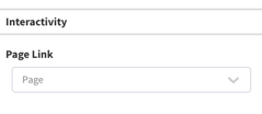
Interactivity