Margaret Mary Health Foundation
Margaret Mary Health Foundation, a Healthcare institution from Batesville, IN, chose OmniAlly to build their digital donor board to replace printed inserts that cost a reprint every time a name was misspelled.
Recognition Challenges
This is the only public screen in the building. Everything about the brief followed from that.
Key challenges included:
-
A hospital designed deliberately without screens, into which one had to be introduced without jarring
-
A permanent capital campaign donor wall nearby that the new display must not compete with
-
A firewall and plumbing behind the chosen wall, ruling out the recess the team had wanted
-
ADA limits capping anything mounted in the corridor at four inches of protrusion
-
Hospital IT requirements: a segmented network, their own machine image, their own endpoint security
-
Annual giving that changes every year, with team member donors recognised separately
The Quieter Sister
Our first round of concepts was wrong, and the client told us so. They were too loud for the space — competing with the capital campaign wall rather than complementing it.
The feedback was unusually clear: this should take a backseat. The permanent wall honours the people who made the building happen. This one recognises the people who keep it running, and it should feel like a quieter sister to it rather than a rival.
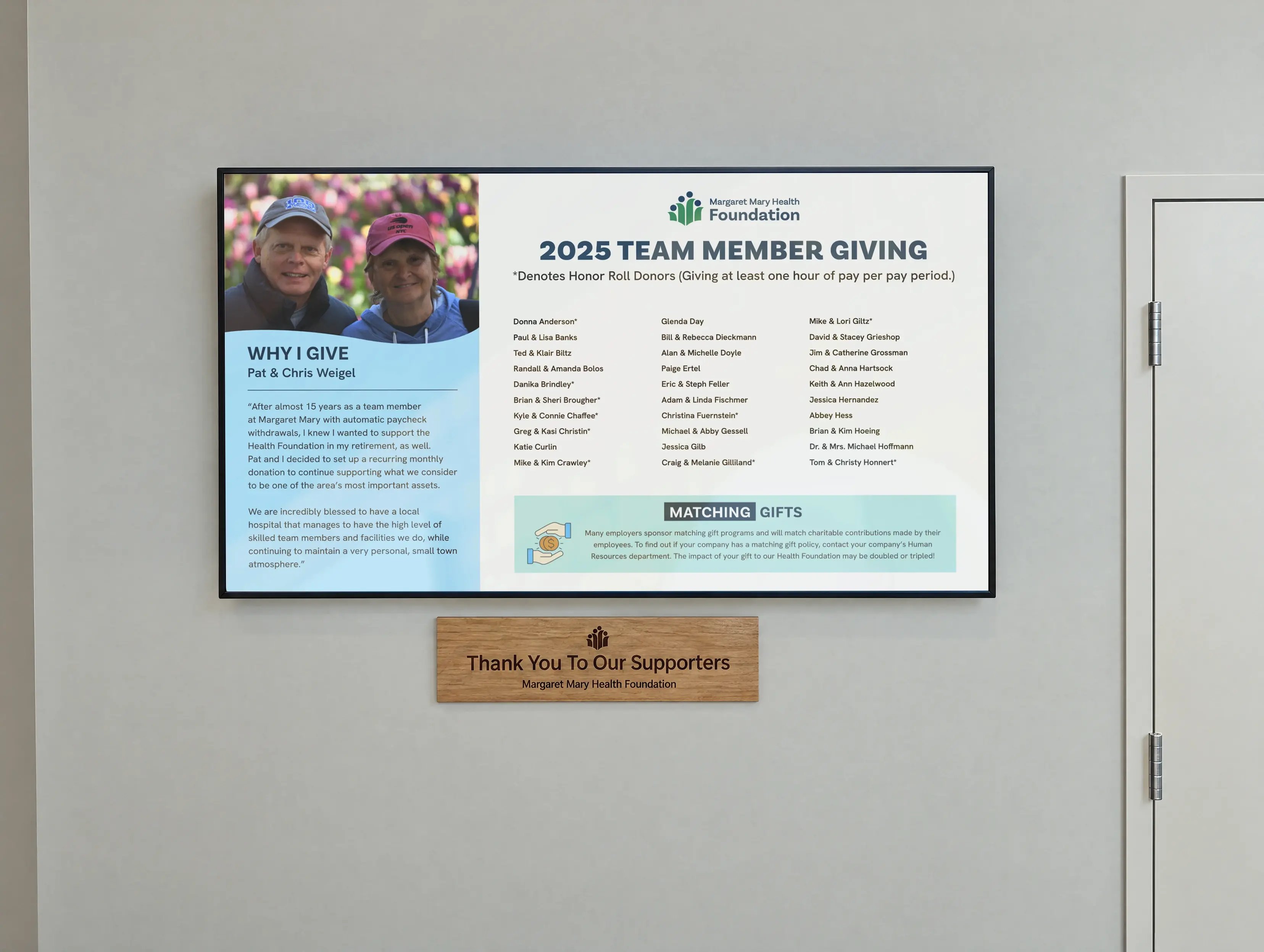
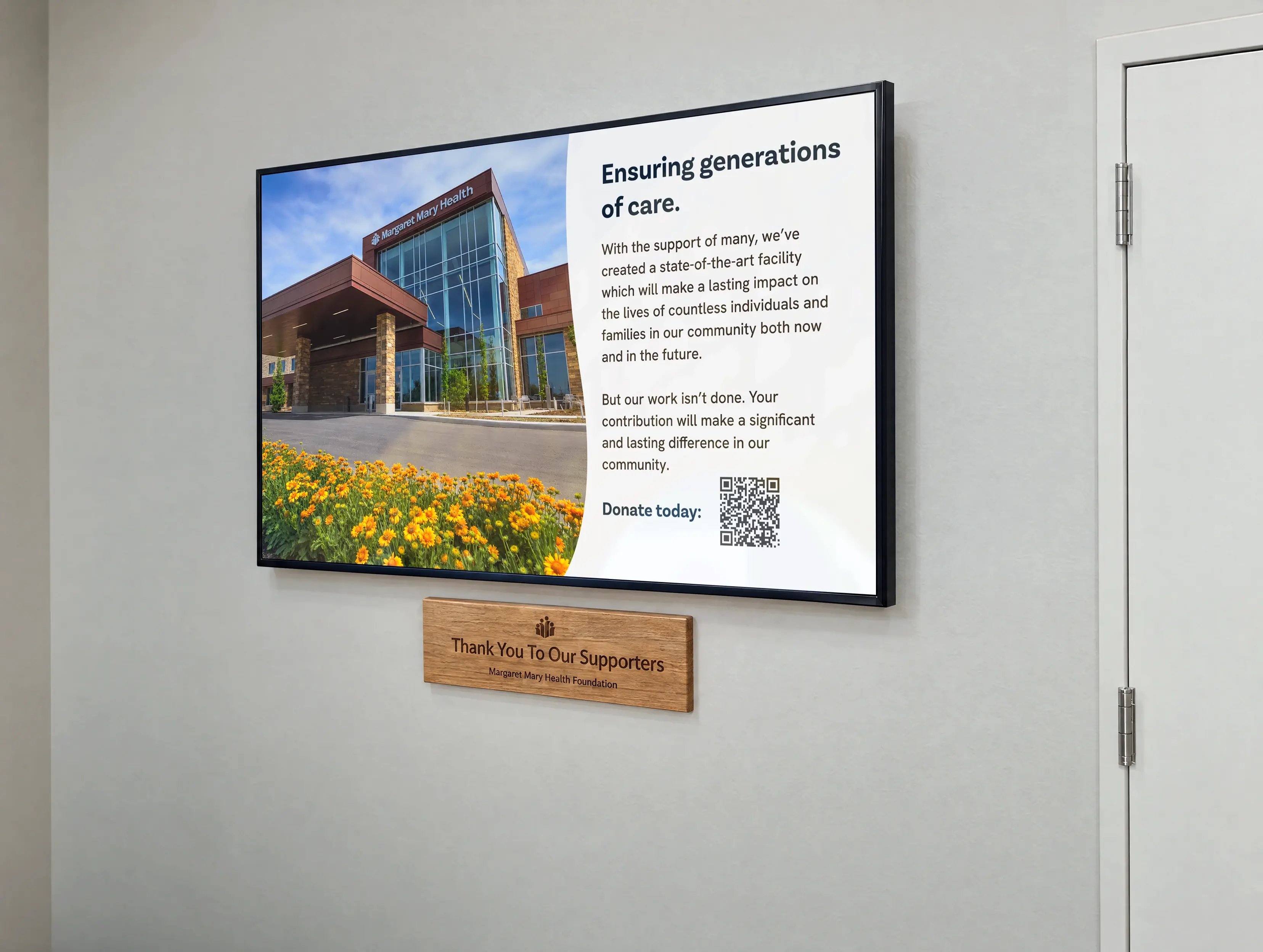
So we started again. The second direction stripped the hardscape back to a tone-on-tone treatment that sits with the corridor's palette instead of announcing itself, and put the warmth into a single engraved plaque beneath the screen.
Our Solution
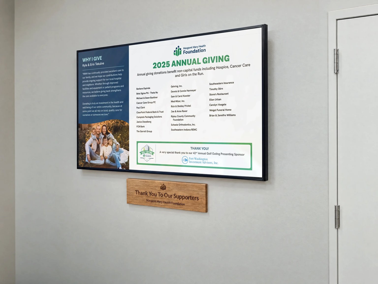
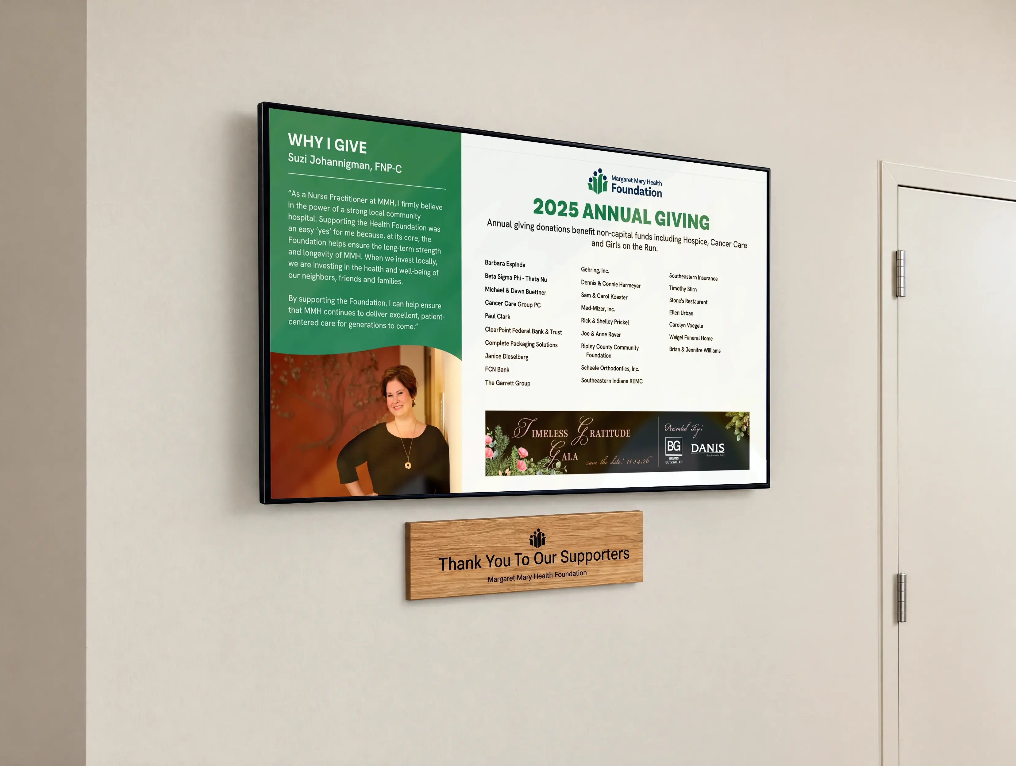
A single 65-inch commercial display rated for continuous operation, in a custom hardscape finished flush with the face of the screen. Recessing into the wall wasn't possible, so we built the enclosure to sit level with the panel instead — the same visual effect, within the four inches ADA allows.
The machine behind it runs on the hospital's own terms. Margaret Mary's IT team supplied the computer, their own image, their own endpoint protection, on a segmented network. The display doesn't depend on that network to keep running: content downloads locally, so an outage doesn't take the wall down with it.
Hardscape design began while the hospital was still being framed, which meant power and data could be specified into the build rather than cut in afterwards.
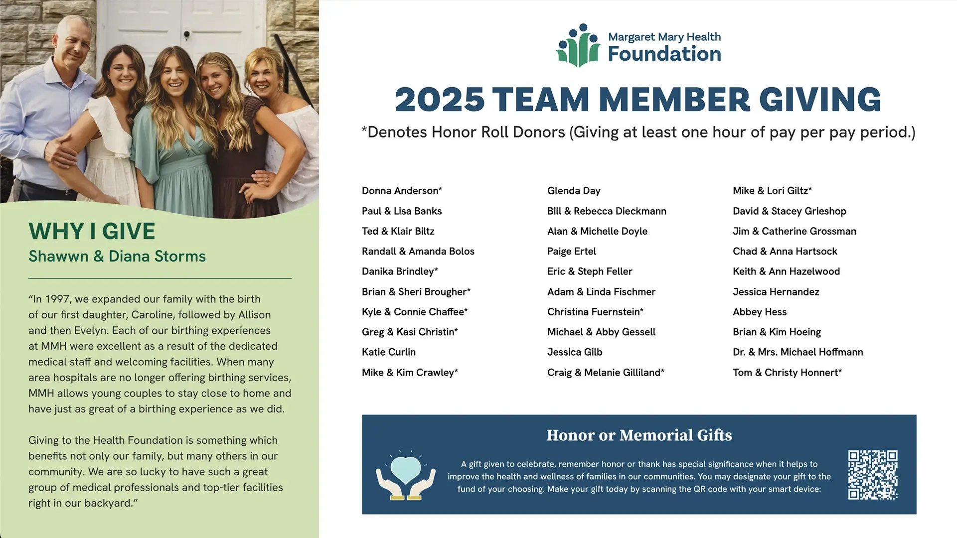
Donor List alongside a Why I Give story and a QR code for giving.
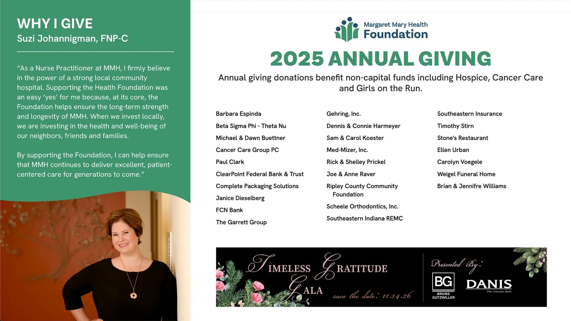
Special Event Footer.
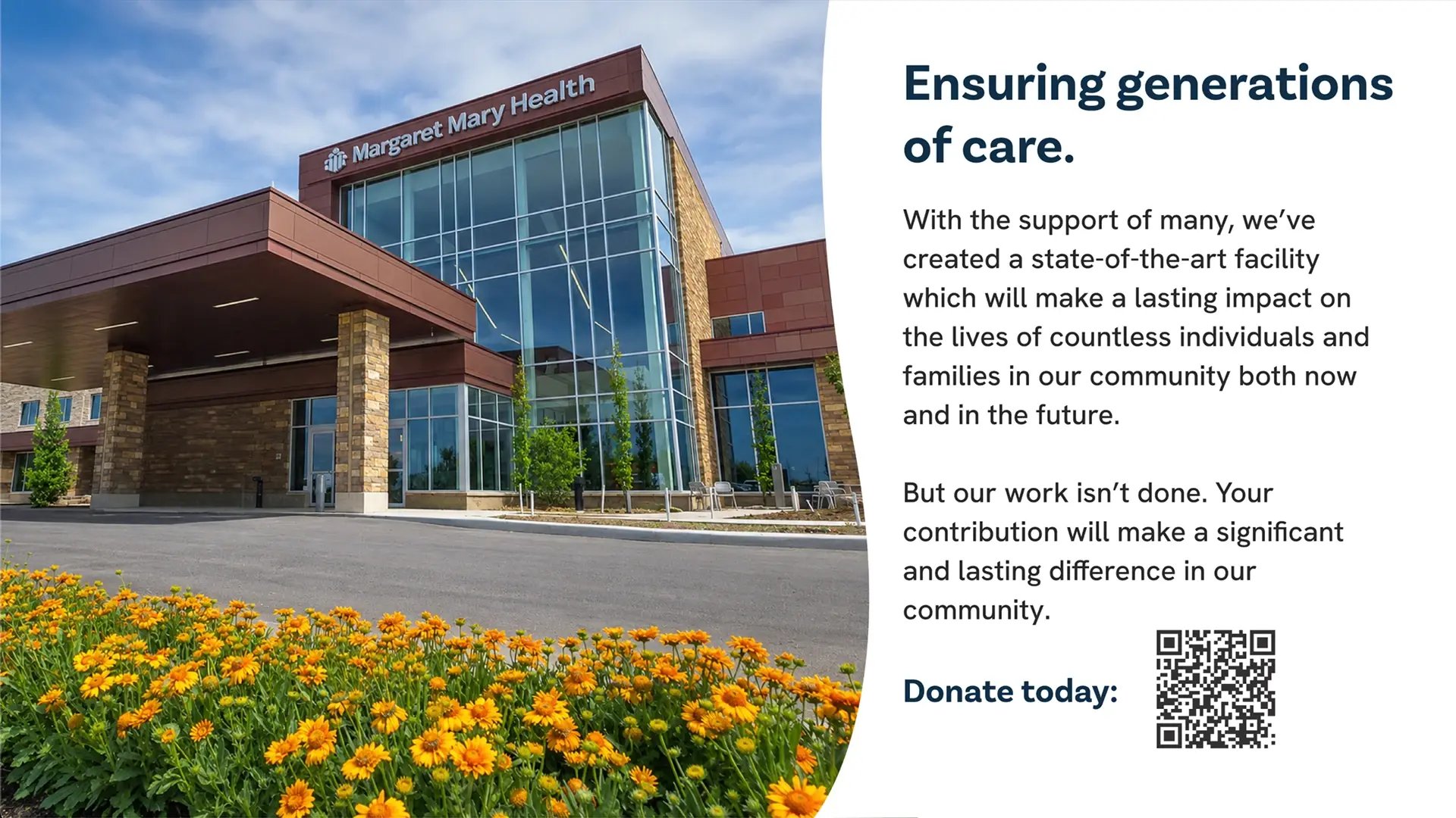
Full-Screen Donate Today call to action.